This blog has been updated with additional content for 2026.
Picking the right kitchen colours is one of the trickier calls in a renovation, and it’s the one you’ll live with the longest. The kitchen is where most of us spend the bulk of our time at home, so the scheme has to hold up day after day. In an open-plan layout it matters even more — the kitchen colour bleeds into the living and dining zones, so the whole space needs to read as one. Choose something you’ll still like in ten or fifteen years, because nobody re-does a kitchen on a whim.
The colours that work best in Auckland kitchens are the balanced, long-lasting ones — a neutral base carrying most of the room, with bolder tones used sparingly as accents. Light-reflective neutrals (white, cream, light grey) stay the most popular base because they bounce daylight around and keep small or shaded kitchens feeling open. Accent colours — terracotta, deep blue, mustard — earn their place in smaller doses, where they add character without taking over.
The principle most designers fall back on is the 60-30-10 rule: 60% of the room in a dominant colour, 30% in a secondary tone, 10% in an accent. It’s one of the oldest guidelines in interior design, rooted in colour theory and proportional balance, and it’s still the easiest way to combine several colours without the room feeling chaotic or flat.
Below we’ve pulled together a range of kitchen colour schemes and ideas to get you started. Matching colours can feel risky. Take the leap anyway — some of the best kitchens we’ve built came from a homeowner backing a combination they weren’t sure about.
Content in this Article:
- Kitchen Colour Combinations
- Kitchen Colour Ideas
- Kitchen Designer Tips
- Dos and Don’ts for Your Kitchen Colour Scheme
- Ideas to Brighten Your White Kitchen
- Modern Kitchen Ideas
- Sustainable Kitchen Colours for 2026
- Sustainable Colours for Auckland Apartments
- 常见问题
Kitchen Cabinetry Cost Calculator (results in under 60 seconds)
The average cost of kitchen cabinetry in Auckland varies depending on the size and layout of your kitchen, the materials you choose, and how complex the design is. Our kitchen cabinetry cost calculator gives you a quick, rough estimate so you can get a feel for the numbers before you go any further.
Kitchen Cabinetry Cost Calculator
“The 60-30-10 rule is still our go-to for Auckland kitchens — it keeps schemes timeless while letting accents add personality without overwhelming the space.” — Eunice, Senior Designer at Little Giant Interiors.
10 Unique Kitchen Colour Combinations
Most kitchen colours these days play it safe — white or grey tones with a hint of black on the benchtop. If you’re up for something different, here are ten combinations worth considering.
1. Green + Gold
Use reflective white elements like tile and stone alongside metallic gold accents — cabinet hardware, tapware, light fixtures — to lift a saturated green. The polished surfaces catch the light and give the kitchen a bit of sparkle.

2. Dark Blue + Light Blue
Blending several blue hues creates a timeless scheme. Start with a lighter tint on the bigger elements — cabinets, walls, or the splashback — then layer deeper blues through rugs, furniture, dishware, or window coverings. Make sure the blues share similar undertones so they don’t clash.

3. Dark Grey + Green
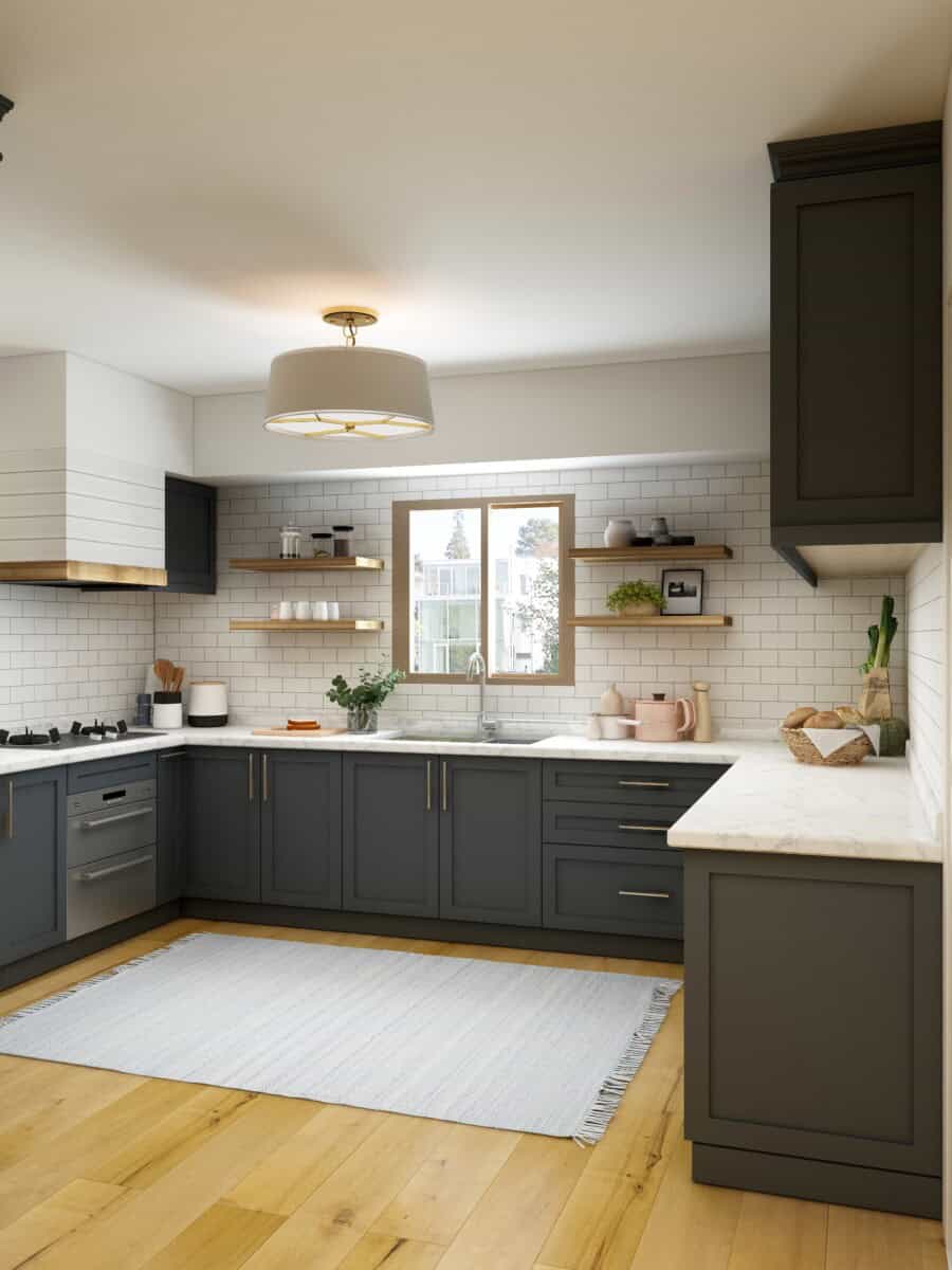
For a contemporary scheme, pair deep stormy grey with an energising lime green. Keep grey for the permanent elements and save green for the things you can swap out — island stools, a rug, artwork, benchtop accessories. Balance it with plenty of white on the upper cabinetry, walls, or splashback so the room doesn’t feel sombre.
4. Black + Orange
This one brings a kitchen to life. Bold citrus orange against black is striking, and both work beautifully with bright white cabinetry and joinery. It’s a confident look that suits a contemporary space.


5. Red + Yellow
Red and yellow is an unexpected pairing. Combine a rich crimson with a golden yellow for the feel of an elegant English home. Use yellow as the anchor and bring red in as accents to give the room depth.
6. Grey + Purple
Purple in a kitchen is a risk, but done right it’s regal and impressive. It’s far less daunting when grounded in a dark charcoal grey. Against a neutral backdrop, royal purple accents stand out without overpowering. Keep plenty of white in the mix.
7. Blue + Brown
A combination that appeals to almost everyone. Pair a crisp sky blue with chocolate brown for a modern look, then add a few brighter accents for interest. Go deeper on both colours and finish with bright white and gold touches for a more historic feel.


8. Grey + Yellow
Grey is back, and plenty of people now prefer it to white. On cabinets or walls it brings a calm, settled feel. Introduce a vibrant accent — yellow works well — to lift it. Grey sits happily next to almost any colour, which makes it a flexible base.

9. Black + Red
Don’t write off red — it’s surprisingly adaptable, especially next to a dark neutral. Pair it with black benchtops, flooring, or cabinetry to keep it balanced.

10. Brown + Mint Green
Rustic golden brown looks fantastic with soft mint green. The advantage here is you’re not locked into a single shade of brown — bring it through wood flooring or a timber island, then pair it with a mint splashback or mint cabinetry.
Check out our kitchen cabinetry cost calculator
“Matte neutrals with metallic accents are timeless in Auckland kitchens — they add depth without showing fingerprints or glare in open-plan spaces.” — Journie, Designer at Little Giant Interiors.
15 Kitchen Colour Ideas
Take some inspiration from the ideas below. There’s a whole spectrum to work with, so don’t feel boxed into neutrals if a bit of colour is what the room needs.
1. Go For a Classic Blue and White Combination
Blue and white is a stunner in both traditional and contemporary kitchens. Blue layers well with other shades of itself for a cohesive effect, and it looks great against soft pastels and cosy neutrals.

2. Go Green on Green
Green is a quietly interesting choice. Inspired by the natural world, it’s calming with a hint of tradition. Strong but settled, it can hold a room on its own or sit back and let bolder furnishings do the talking.
3. Warm Up With Brown
Brown isn’t an obvious pick, but rich caramel tones read as neutral and carry a quiet opulence — elegant and a little daring at once. It suits hard-working spaces like kitchens and pantries, where the colour doesn’t need to dominate.

4. Weave In Earthy Tones
Rich, cosy browns and clay tones are firmly in style. Earthy colours help a kitchen design strike a balance — lighter benchtops against earthier cabinetry.
5. Don’t Hold Back With Black
Dark colours and black are increasingly common in modern kitchens, and they bring drama, weight, and firmness to a room. Worked in subtly — through painted cabinetry, say — black adds definition and depth without needing a full redesign.
6. Go Bold With Yellow
The kitchen is where a lot of living happens — cooking, eating, talking, scrolling. Yellow lifts the mood, which makes it a great choice if your kitchen is short on natural light.

7. Make Your Island Pop
Use a completely different colour on the island, or a lighter or darker take on a shade used elsewhere. It adds colour while keeping the room feeling light and airy. Carry the same accent through your tableware, lighting, and rugs.
8. Opt For Calming Grey
Grey is timeless and works well in a kitchen. Neutral schemes never date, and a bit of considered accessorising brings in colour and personality.

9. Keep It Classic With White
White is timeless for good reason. It reflects light, makes walls recede, and visually enlarges a small space. The result reads as neat, sophisticated, and calm.

10. Add Colourful Splashes to Neutrals
Cabinetry and appliances are expensive and slow to replace, so most of us keep them neutral — white, grey, stainless, polished concrete, timber. That makes them the perfect canvas for bold colour brought in elsewhere. Painted cabinets in a vibrant shade are an easy way to add character.
11. Have a Statement Wall
A statement wall is a strong way to introduce bold colour without committing the whole room to it. Keep the rest of the kitchen white to let the feature wall do the work.

12. Join the Dark Side
Go the other way entirely and commit to dark colours. Dark walls hide flaws and even out textures, and they look their best when used boldly. Rich browns and blacks on walls and cabinetry make a powerful, stylish statement.
13. Go For Green
For green schemes, lean towards milder, cooler shades in sunny, well-lit rooms. If your kitchen faces south or gets little natural light, lighter green tones will help it feel brighter.
14. Create Contrast With Colour
In a mostly white kitchen, contrast black or deep grey against the white — but play with the proportions. Pairing dark cabinetry with marble and texture feels warmer than a flat 50/50 split. Heavily grained timber doors help break up the space.
15. Be Brave With a Daring Scheme
A vivid red kitchen is often seen as a gamble, but used imaginatively it adds real energy. Bright red cabinetry can lift a sombre green-grey scheme, and matching accents tie it all together.
4 Kitchen Designer Tips for Picking Your Colour Scheme
You can research a kitchen colour scheme for weeks, but nothing replaces professional advice. We asked our in-house designers for their best tips. Here are four worth keeping in mind.
1. Pull Your Scheme From the Largest Pattern in the Space
Look around the room for inspiration in patterns you already have — on furniture, rugs, or decor. The whites and beiges in those patterns make a reliable neutral base.
2. Back to Black
A bit of black makes other colours read more clearly. Start small with black decor pieces for a subtle lift. For a bolder effect, paint the base cabinets black.
3. Use the 60-30-10 Rule
Our designers come back to this one constantly. Split the room into 60% dominant colour, 30% secondary, and 10% accent. The ratio keeps everything balanced while still leaving room for a pop that draws the eye.
4. Consistency Without Boredom
It’s easy to default to one colour or stay entirely neutral — and easy to end up with a flat, boring kitchen as a result. Don’t be afraid to mix it up. Pick one or two recurring elements that run through the whole home, then use contrasting colours across the cabinetry, splashback, and accessories.
Dos and Don’ts of Kitchen Colour Schemes
Do
Learn the basics of warm versus cool colours. Recognising the temperature of a colour helps you match it properly to your benchtops and cabinetry.
Do
Have fun with it. Colourful plates and accessories add an easy splash. A wall-mounted wine glass rack filled with colourful stemware is a stylish way to bring colour in.
Do
Remember that even a kitchen with beautiful cabinets and benchtops benefits from colour. The smallest tint on a wall can breathe life into a flat room without changing its atmosphere.
Do
Use lighting to add colour. You don’t need vivid pendants — brushed gold, bronze, and black are the popular metallic finishes right now. Soft gold bulbs alone can add depth.

Don’t
Be scared of colour. It might run against the current white-and-grey trend, but not every kitchen suits the same look. A colourful accent wall can be exactly what a flat kitchen needs.
Don’t
Overuse one colour. Your kitchen’s fixed features stick around for years, so keep those more neutral and bring colour in through walls or accents you can change later.
Don’t
Forget that colourful linens are a cheap way to shift the look. Tea towels can be swapped out seasonally or whenever you fancy a change.
Don’t
Ignore the adjacent rooms. An open dining or family area benefits from an accent wall, and scattering a few of the kitchen’s colours through the space ties everything together.
5 Ideas to Brighten and Update Your White Kitchen
An all-white kitchen can start to feel flat over time. With plenty of new trends about, here are a few ways to work some colour back in.
1. Choose Colourful Cabinetry
Cabinetry takes up roughly 60% of a kitchen’s visible surfaces, so coloured cabinets make a big statement. Pick a colour you’ll still love years from now. If you’re worried it’ll overpower the room, balance it with open storage and stark white walls.

2. Install a Colourful Tile Splashback
Colourful tiles add texture and personality to an otherwise plain wall, and they’re hard-wearing and easy to clean. Run a few rows below the upper cabinets, or take the splashback all the way to the ceiling for a bolder treatment.
3. Sleek Transitional Style
Shaker-style cabinetry bridges traditional and modern. Pair it with stainless appliances and brushed nickel rod pulls for a clean, transitional finish.
4. Customise With Colour
Straightforward shaker cabinets let the colour speak for itself. Coloured stains let the timber grain show through, giving a more textured, deeper finish than painted cabinetry. An overall glaze softens the colour and plays up the simplicity of the shaker form.
5. Clean and Contemporary
Use horizontal and vertical planes, free-form panelling, and considered shadow lines for a contemporary look. Slab doors with concealed euro hinges keep the base cabinets sleek.
7 Modern Kitchen Ideas
1. Give Your Cabinets a Facelift
Your cabinets are the first thing you see when you walk in. Design them around the look you’re after — slab cabinetry with modern hardware tends to suit a contemporary kitchen better than shaker. Think about whether you want the cabinets to be the focal point; if so, a striking colour does the job.
2. Time for New Benchtops
Benchtops are the best way to anchor a scheme or tie open shelving together. Marble is back in favour — its natural colour and movement bring a touch of elegance and visual interest.
3. Stainless Steel Appliances
Sleek stainless appliances give a kitchen a sharp edge. They can read cold in an all-white room, so warm them up with timber benchtops or cabinetry for a classy result.
4. Let More Natural Light In
Bringing in natural light is easier than you’d think. Use simple shades and light-reflecting colours, and make the most of every window you’ve got.
5. Frameless or Full-Overlay Cabinets
Frameless cabinets are a staple of modern design — straight lines, minimal detail. The doors cover the cabinet box entirely for a clean, sophisticated finish. Both shaker and flat-panel doors can run frameless.
6. Minimal Detail and Ornamentation
Modern kitchens strip back the fuss so the essentials stand out. Skip busy textures and wall clutter, and let a single material, colour, or piece of hardware create the focal point.
7. Natural Materials
With less ornamentation, natural materials get their moment. Exposed timber grain on floors, benchtops, or cabinetry looks fantastic. For extra impact, try a splashback in timber slats or exposed brick.
The most important step in any kitchen design is settling on a colour direction. Once that’s sorted, everything else falls into place. Just make sure it’s a colour you won’t tire of, and one that works with the rest of your home.
Sustainable Kitchen Colours in 2026
The sustainable kitchen schemes we’re seeing most in Auckland lean into soft earthy neutrals — warm greiges, sage greens, terracotta undertones, creamy off-whites — paired with natural timber accents and low-VOC matte finishes. The appeal is straightforward: they’re timeless, they’re forgiving in a humid climate, and they let you spec genuinely low-impact materials without compromising the look.
The sustainability story really comes down to two choices: the paint and the cabinetry. Both are where the harmful chemicals usually hide, and both have solid low-impact options in New Zealand.
Why low-VOC matters in a kitchen
VOCs — volatile organic compounds — are the solvents that off-gas as paint dries, and traditional solvent-based paints can keep releasing them for weeks. Lowering VOCs improves indoor air quality both while the paint cures and afterwards, which matters in a room you cook and live in daily. In New Zealand, the official benchmark is Eco Choice Aotearoa (formerly Environmental Choice New Zealand) — an ISO 14024 ecolabel that sets strict VOC limits and screens out heavy metals like lead, cadmium and mercury under its paint standard, EC-07.
The progress here is real. Resene reports that average per-litre VOC levels across its decorative paint sales have dropped by more than 90% over the past three decades, with no-added-VOC options like Zylone Sheen Zero now available for most interior applications. For specification detail, low-VOC paints are covered in AS/NZS 2311 “The Painting of Buildings.”
Don’t forget the cabinetry
Paint gets the attention, but cabinetry is the bigger hidden source. Kitchen cabinets are often built from chipboard, MDF or plywood bonded with formaldehyde-based glues, which can off-gas into the room. If sustainability matters to you, look for low-formaldehyde or formaldehyde-free board, FSC-certified plywood, or solid timber. It’s the single change that does the most for air quality in a kitchen build.
Why earthy neutrals lead the sustainable look
- Soft earthy neutrals (greige, sage, warm taupe, creamy off-white) dominate because they’re light-reflective, easy to maintain, and don’t date — so the kitchen lasts longer before anyone wants to redo it. Longevity is itself the most sustainable outcome.
- Terracotta and muted clay tones work as warm accents and increasingly come in natural-pigment, low-impact formulations.
- Natural timber accents (oak, walnut, rimu) add warmth and depth; FSC certification confirms the timber is responsibly sourced.
- Matte finishes hide fingerprints and water marks better than gloss, which matters in a humid Auckland kitchen.
- Eco Choice–approved low-VOC paints are widely available across sheen levels from gloss to flat, so going low-VOC no longer limits your finish.
Sustainable colour and material choices at a glance
| Choice | Why it works in a kitchen | Sustainability benefit |
|---|---|---|
| Soft earthy neutrals (greige, sage, taupe) as the 60% base | Light-reflective; timeless; easy to maintain | Longevity reduces how often the kitchen is redone |
| Terracotta / muted clay accents (10–20%) | Adds warmth without overwhelming | Natural-pigment, low-impact options available |
| FSC-certified timber accents (oak / rimu / walnut) | Adds depth; seals well for humidity | Responsibly sourced; FSC reduces deforestation impact |
| Eco Choice–approved low-VOC matte paint | Reduces glare; hides marks; cures faster | Meets EC-07 VOC limits; better indoor air quality |
| Low-formaldehyde or FSC board cabinetry | Same look as standard board | Cuts the largest hidden source of off-gassing |
“A balanced, neutral-led scheme with timber accents is one of the easiest ways to make a kitchen feel both warm and timeless — and it lets us spec low-VOC, FSC-certified materials without changing the look our clients want.” — James, Designer and Head of Operations at Little Giant Interiors.
Kitchen Cabinetry Cost Calculator (results in under 60 seconds)
The average cost of kitchen cabinetry in Auckland varies depending on the size and layout of your kitchen, the materials you choose, and how complex the design is. Our kitchen cabinetry cost calculator gives you a quick, rough estimate for your size of kitchen.
Kitchen Cabinetry Cost Calculator
常见问题
Plenty of kitchens stick with white and black accents, or black with gold fixtures. It really depends on the style you're after. The most popular schemes right now are black, navy blue, white and grey.
Our in-house designers at Little Giant are happy to help. We'll advise on colours that suit the kitchen style you're going for, so you don't have to make the call alone.
Neutral colours — white, cream, grey and black — all suit a modern kitchen. But modern design leaves room to play, so don't feel limited to neutrals.
The 60-30-10 rule splits a colour scheme into 60% dominant colour, 30% secondary tone, and 10% accent. It's one of the oldest principles in interior design and keeps schemes balanced and timeless — which is exactly what suits Auckland's open-plan layouts, where the kitchen colour flows into the living and dining zones.
White, cream and light grey bounce daylight around, which keeps small or shaded kitchens feeling open and bright. They also don't date, so the kitchen lasts longer before anyone wants to redo it. That's why they remain the most common base for new Auckland kitchens.
Yes — used sparingly. Kept to around 10% of the scheme, bold accents add character and warmth without taking over. The risk is overusing them, which can make a small space feel heavier, so balance them against a neutral base.
Matte finishes hide fingerprints and water marks better than gloss and cut down on glare, which makes them a popular choice in open-plan Auckland kitchens. Low-VOC matte paints are now available across most sheen levels.
Soft earthy neutrals — greige, sage, warm taupe, creamy off-white — as the base, with terracotta or clay accents and natural timber details. The real sustainability gains come from the materials: Eco Choice Aotearoa–approved low-VOC paint (EC-07 standard) and low-formaldehyde or FSC-certified cabinetry.
VOCs are solvents that off-gas as paint cures and can affect indoor air quality. Low-VOC and no-added-VOC paints reduce that, which matters in a room you live and cook in daily. In New Zealand, look for the Eco Choice Aotearoa label; Resene reports its average paint VOC levels have dropped over 90% in three decades.
Cabinetry, usually. Standard chipboard, MDF and plywood are often bonded with formaldehyde glues that off-gas into the room. Choosing low-formaldehyde board, FSC-certified plywood or solid timber does more for air quality than the paint alone. What are the popular colours used in kitchens?
What if I can't decide on a colour for my kitchen?
What colour suits a modern kitchen?
What is the 60-30-10 rule and does it work in Auckland kitchens?
Why are light-reflective neutrals so popular in Auckland kitchens?
Are bold accents like terracotta or deep blue suitable for Auckland kitchens?
Are matte finishes better than gloss in a kitchen?
What are the most sustainable kitchen colours for Auckland in 2026?
What is low-VOC paint and why does it matter in a kitchen?
What's the most sustainable choice in a kitchen — paint or cabinetry?
Sources
- Eco Choice Aotearoa — paint standard EC-07 (ISO 14024 ecolabel; VOC limits and hazard screening): ecochoiceaotearoa.org.nz
- Resene — low-VOC and no-added-VOC paints (90%+ reduction in average VOC over three decades): resene.co.nz
- Dulux NZ — low-VOC paints and AS/NZS 2311 “The Painting of Buildings” reference: dulux.co.nz
- ecostore — formaldehyde in kitchen cabinetry and FSC / solid-timber alternatives


 24")